
A. Craig & Son Painting
Overview
A Craig & Son Painting came to me to have their logo modernized as they sought to expand their marketing materials. I designed a new logo that enhanced the brand’s image while preserving enough of the original to guarantee continued brand recognition. In addition to the primary logo, I provided an 85th anniversary alternate logo, business cards, t-shirts, signage and vehicle wraps.
Objective
Update the company’s logo while preserving its core elements. Leveraging this redesigned logo as a foundation, create an 85th anniversary alternate logo to commemorate the milestone. Subsequently, implement the new logos and across various mediums, including t-shirts, business cards, signage, and vehicle wraps.
Key results
Research
I researched the company’s competitors and analyzed their marketing materials. I used these to understand the industry trends and to determine how A. Craig & Son could stand out. Also, I researched businesses that have secondary logos and how they maintained key elements and brand standards.
Ideation
Central to the logo redesign process was the recognition of the pivotal role played by the "A" element within the existing design. While maintaining the core elements, the approach focused on simplifying them to achieve a more contemporary aesthetic. Through this iterative process, I successfully evolved the logo, striking a balance between honouring tradition and embracing modernity.
After the initial logo redesign was finished, the client wanted me to create an alternate logo to celebrate their 85th anniversary. Despite considering various options and presenting them to the client, it became evident that the shield design emerged as the most compelling choice.
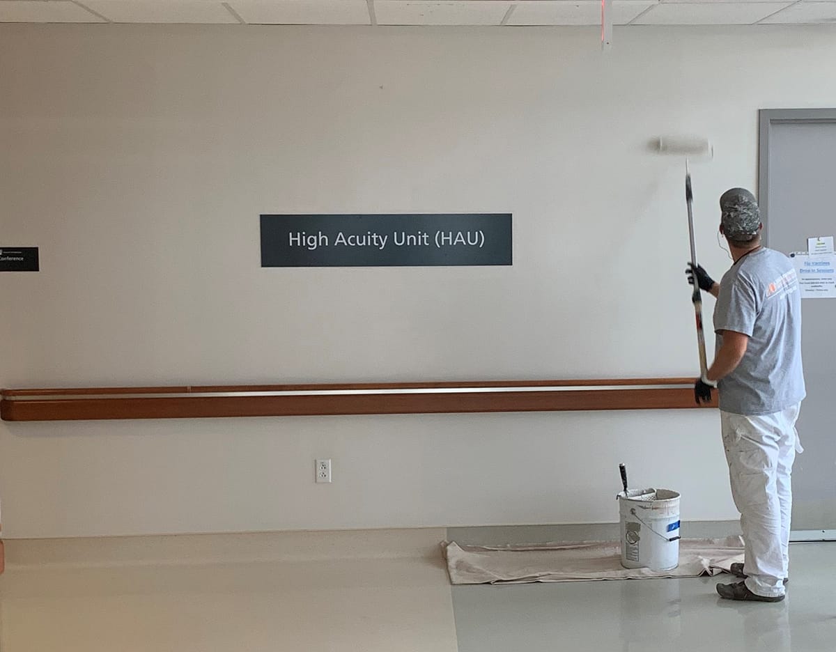
Following the success of both logos, the client reached out for further work to design business cards, t-shirts, signage and vehicle wraps using the redesigned logos as inspiration.


Challenges
- Incorporating the business' tagline into the logo.
- Protecting the brand identity of a family-run business that has been around for 85 years while pushing it to grow.

Final results
The client was ultimately satisfied, despite budget constraints which required the exclusion of certain elements. Nevertheless, the client expressed excitement with the possibility of using them in the future when the budget allowed it. The redesign represented a crucial step in refining the brand's image, essential for remaining competitive in a crowded marketplace and reaffirming their commitment to excellence. Although not all aspects were implemented, the updated brand identity provided a solid foundation for future growth, positioning the company for continued success.


Bois Wines
Bois is a conceptual wine brand I created to push my design boundaries by tackling the challenge every wine brand faces—standing out in a sea of predictable labels.

Ryan Hartt Real Estate
Ryan Hartt is a top 10% Vancouver real estate agent who needed branding to match his performance. He came to me for a complete brand overhaul—logo variations, color palette, typography, guidelines, the full package.

