
PayByPhone Block Party
Overview
During the height of the COVID-19 pandemic, I developed and executed the design of a ‘support local’ campaign for PayByPhone. The campaign aimed to increase the company’s mobile app adoption and promote local business support through a series of social media contests. This initiative became one of the company’s most successful social media campaigns.
Objective
Design a ‘support local’ campaign that would increase PayByPhone’s mobile app adoption and promote local businesses across the company's five key cities in North America.
Key results
Research
Before starting the ideation phase of this project, I needed to decide what design style would best support the campaign goals. To make this decision, I conducted market research on campaigns in the target regions, including some that also focused on supporting local businesses. Understanding each of the five markets was important so that the designs would be impactful for each target audience.

Ideation
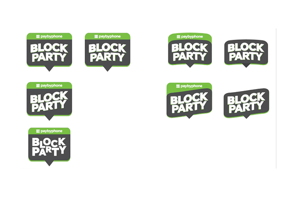
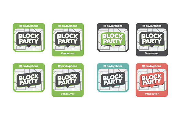
Creating the visual identity for this campaign was a welcomed challenge. The company was gearing up to launch its new brand and wanted this campaign to balance the old branding with the new (not yet launched) branding. This was a complex request that could have resulted in the assets looking disjointed. Luckily, I was given plenty of freedom to test what combination of the brands was most impactful. I worked closely with the Creative Services Manager, who was able to provide further insights into when to use new versus old brand elements.
Challenges
- Create a visual identity that balances the new (not yet launched) and old branding without the design looking disjointed.
- Ensure the campaign direction was effective and engaging for the five target audiences.

Final results
The success of this campaign was high above the company’s expectations and became their most effective campaign in 2021. The social media assets and landing pages earned a higher engagement than the team had hoped for. Because of the strong vision and design direction this campaign had, the desired app adoption was reached and social engagement was exceeded.


Parking Coupons
I led the design of a promotional video for PayByPhone’s latest product feature–Parking Coupons. The animated video showcased the feature's unique benefits to educate each of the company’s target audiences. I managed this project from ideation to completion, creating the script, storyboard, animation in After Effects, and voiceover.

Simplify Your Summer
Building on the success of PayByPhone’s ‘Block Party’ campaign, I developed and executed the creative vision for a second ‘support local’ campaign. The goal of ‘Simplify Your Summer’ was to grow adoption for the PayByPhone app.

