
Sombrio Catalogue
Overview
Sombrio makes mountain biking gear, and in 2020 they needed their yearly catalogue to connect with riders instead of just showcasing products. The theme was exploring 'shred' from a biker's perspective—which meant my goal was to balance storytelling with featuring the collection.
I handled everything from art direction to the photo shoot that provided our main assets. While I was at it, I filmed and edited a collection preview video that they used in sales conferences and social media. Sometimes you just end up doing it all because that's what the project needs.
Objective
To produce a catalogue that captured the authentic 'shred' experience—the rush, the community, the whole culture—while showcasing Sombrio's gear. The challenge was making something that felt real to the community while still doing its job commercially.
Key results
Research
I needed to understand what would resonate with riders, so I dug into both Sombrio's past catalogues and what their competitors were doing.
Starting internally, I went through previous catalogues I hadn't worked on to see what connected with their audience and what fell flat. I made notes on what was working well and what needed serious improvement for this round.
Then I analyzed competitor catalogues and marketing materials to get a feel for industry trends and figure out where Sombrio could stand out. The research gave me a clear picture of the landscape and showed me exactly where the opportunities were.
Ideation
The research gave me the foundation I needed, so now it was time to figure out how to tell the visual story.
I created a storyboard approach that let me work out the balance between the featured rider's journey and showcasing the new apparel. The key was making sure neither story overshadowed the other—riders needed to see themselves in it, but people also needed to want the gear.
The result was a visual flow that felt natural instead of forced. I was genuinely happy with how it came together—sometimes the pieces just click into place when you've done the groundwork right.
Challenges
- This was Sombrio's biggest print project of the year, which meant everyone and their manager had opinions. Too many voices can kill deadlines fast, so I focused on keeping communication crystal clear between all stakeholders.
- I also had to work with a team that did everything manually instead of using Data Merging, which is what I'm used to. Not gonna lie, it was frustrating at first, but once we figured out how to sync up our different workflows, it worked out fine. Every team works different and you have to find your rhythm.

Final results
Every stakeholder was genuinely impressed with how the rider's story and product showcase balanced each other—nobody felt like either side got shortchanged.
The project worked so well that I created a template version so Sombrio could keep producing quality catalogues without starting from scratch each season. Sometimes the best compliment is when they ask you to make it repeatable.
This ended up being one of my favourite projects—there's something really satisfying about working with a brand that gets their own community as well as Sombrio does.


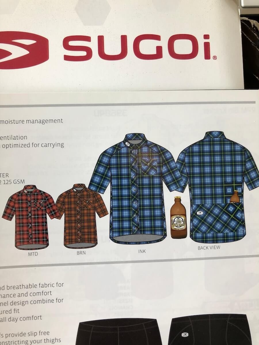
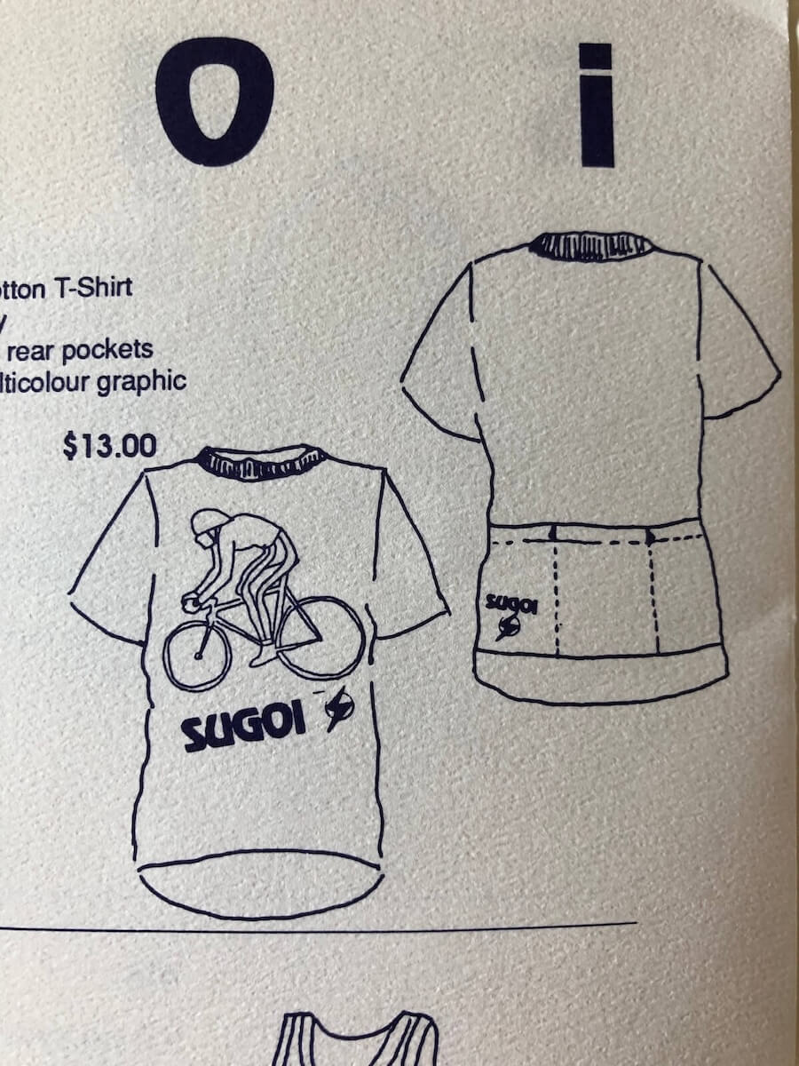
Sugoi Custom
Sugoi is an athletic wear company that specializes in cycling and running. I created the company’s Custom Catalogue–a unique asset featuring the custom collection and how each item could be personalized. The catalogue features a timeless design aimed at simplifying customer choices.

Bois Wines
Bois is a conceptual wine brand I created to push my design boundaries by tackling the challenge every wine brand faces—standing out in a sea of predictable labels.

