PayByPhone Rebrand
Overview
As the Global Senior Visual Designer at PayByPhone—a global parking platform in 1,300+ cities—I played a key role in taking the brand from recognizable to unmistakable.
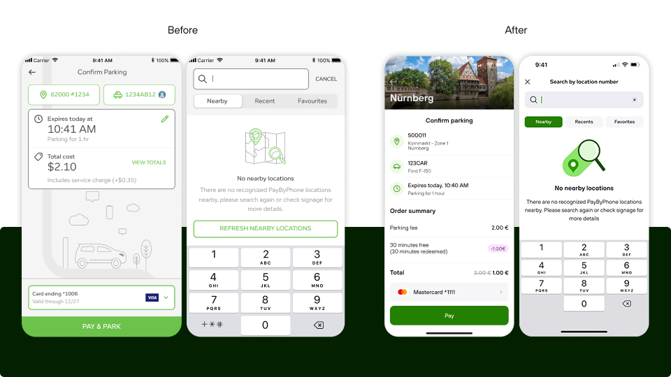
When an accessibility review flagged contrast ratio issues in the existing brand, our team decided to rethink how the brand functioned across the entire product ecosystem. As someone who had worked with the brand for nearly four years, I was able to provide art and brand direction on execution across a new visual language, design system, website, and templates — partnering with two designers and working daily with Product, Marketing, and Design.
The before and after couldn't have been clearer—a brand that had been playing catch-up was now setting the pace.
Objective
Turn an accessibility requirement into a catalyst for a more scalable, future-facing brand—one that could be seen, recognized, and understood instantly, in any context.
Rethink how it performed across a rapidly evolving product and global platform, and build a system for speed, experimentation, and consistency across teams.
Beyond individual deliverables, the focus was on creating a system that could be used, adapted, and extended by others—raising the overall quality bar without sacrificing clarity, cohesion, or presence.
Key results
Research
The project began with an audit of what we had against where we needed to be, technically and creatively.
On the technical side, the existing green and white combinations were failing contrast ratio minimums. On the creative side, the current branding wasn't reflected in the product, as it wasn’t adopted back in 2021.
A new team had joined with a mandate to push B2C features forward, and they were testing new designs almost daily. The existing system couldn't support that pace without breaking down. What we needed wasn't a patch—it was infrastructure.
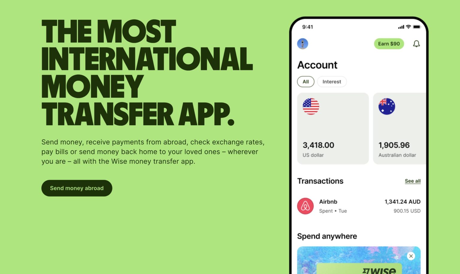
In our research, we looked at brands like Wise, who were able to use impactful and high-contrast greens without them being visually overwhelming.

Ideation
I provided art direction of the refresh, working closely with two brand designers to shape and evolve the system. While they drove exploration within the product space, I set the broader vision and ensured alignment across Marketing, Product, and Design.
We initially started with colours since that was the initial catalyst. However, we quickly realized that we needed to start from the beginning because we needed clarity of who the brand and the product were being designed for. We pivoted by defining new brand values—because without that foundation, visual decisions lack direction. From there, I assisted in the development of colour, typography, logo, illustration, and the design system in parallel, stress-testing each against accessibility standards and real-world use cases. I synthesized feedback, made key decisions, and maintained a clear throughline—so we could move quickly without losing coherence.
Challenges
- The previous brand was agency-built and barely two years old. Real stakeholders had invested in that direction. Navigating that required as much creative leadership as it did design skill— honouring what worked, making a clear case for what didn't, and bringing people along on a direction they could genuinely get behind.
- Working with a team actively pushing the brand to its limits daily meant the goalposts were moving constantly. Keeping the brand unified while staying open to where the exploration was taking us required a clear point of view—and a lot of honest conversations about what was on-brand and what wasn't.

Final results
When someone asks to see my best work, this is where I start — not just for how it looks, but for how it holds together under pressure.
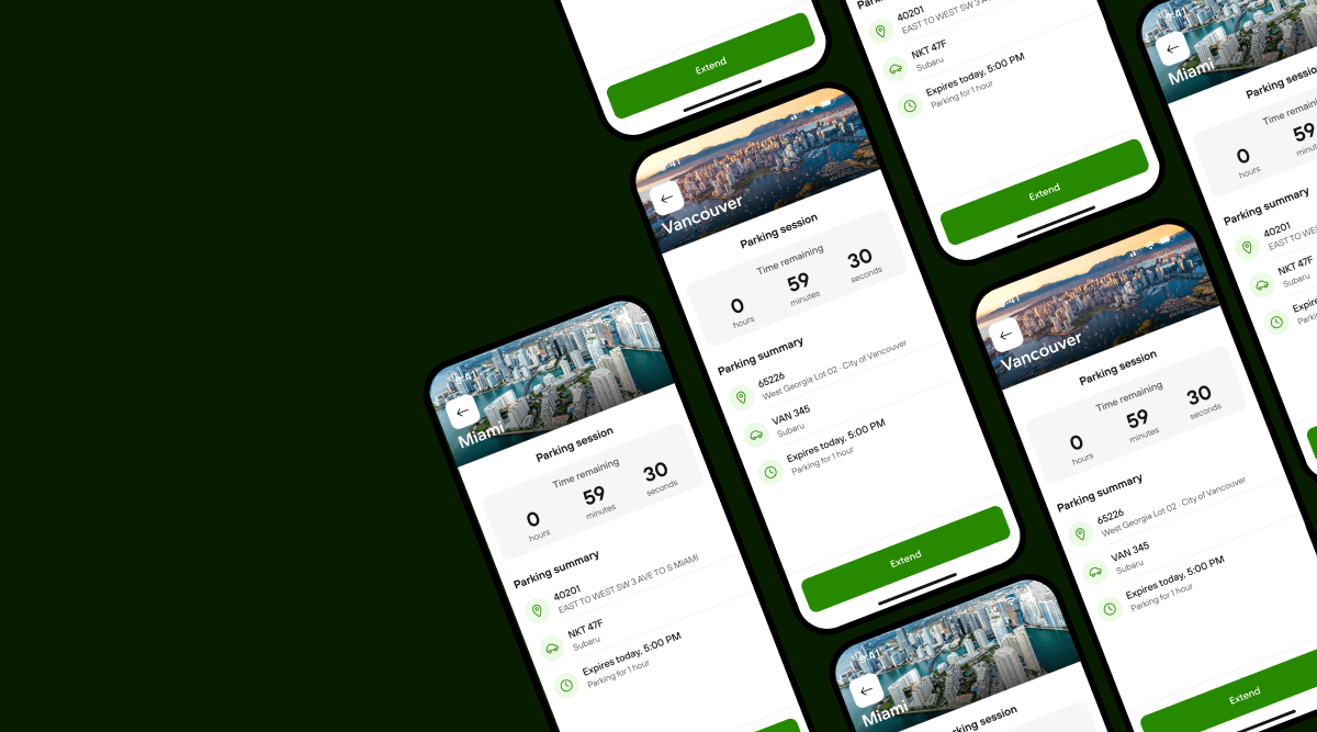
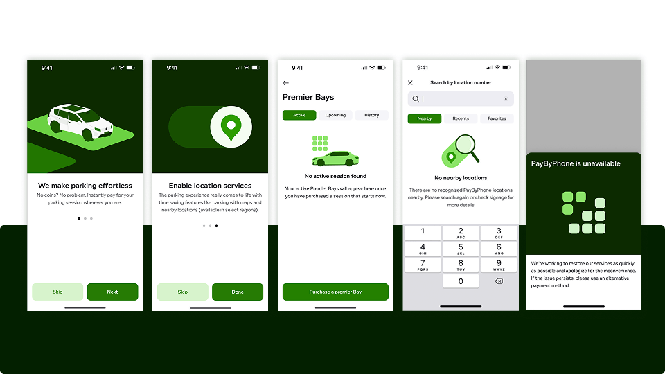
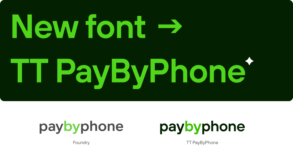
After nine months, PayByPhone launched a refreshed brand alongside a rebuilt app—a deeper, more accessible green palette, a custom typeface developed in partnership with TypeType, a new illustration system, and a design infrastructure built to scale globally across every touchpoint.
What began as a complex and, at times, sensitive shift ultimately led to strong alignment across stakeholders, with broad buy-in to the new direction. Teams across Product, Marketing, and Design quickly aligned, and the system proved itself in practice—supporting faster iteration without compromising consistency or clarity.
I led the website redesign and the PayByPhone Business product, while art directing the brand end-to-end. The result is already live in the app and rolling out across marketing worldwide—a system that feels bolder, clearer, and unmistakably PayByPhone.

Parking Coupons
I led the design and creation of a promotional video for PayByPhone’s latest product feature–Parking Coupons.

PayByPhone Block Party
A ‘support local’ campaign that increased PayByPhone’s mobile app adoption and promoted local businesses across the company's five key cities in North America.

